Info
| Name | Responsive Product Slider CSS JavaScript |
| Market | codester.com |
| Category | Sliders |
| Tags | carousel, conversion, ecommerce, image slider, images, product slider, responsive, sales, shop |
Overview
Only 1% of people click through carousels.
Product Slider fixes this – making your products more visible & obvious, get you more clicks, and increase your sales.
There are 4 things that make this possible:
Thing 1: Products are more visible
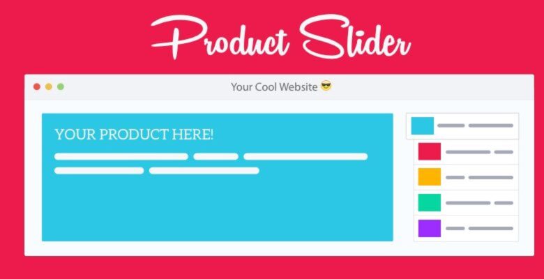
All products are more visible on the right, with clear labels to indicate how many and what products are featured. This characteristic also follows Fitt’s Law — increasing the size of interactive areas and allowing people to explore products faster & easier.
Thing 2: It is fully responsive
Different devices requires different solutions. Therefore, on smaller devices where screen real estate is limited, your products peek out on the right of the screen to encourage interaction.
Thing 3: Clear text & buttons
Your marketing message and buttons are in clear plain text on top of the cover image. This allow for optimal readability and conversion, no matter the device size.
Thing 4: Improved usability
All the major usability issues is fixed. It doesn’t auto rotate, images are size optimised and it is more accessible.
Not convinced yet? Here it is in action: http://www.thispattern.com/slider/example
Or see the research on Product Slider here:http://thispattern.com/product…
Try it. It works better.
Features
- Clear labels indicate how many and what products are available
- Fully responsive and works great on all devices
- Swipe enabled on touch devices
- Clear plain text and buttons allows for optimal readability and marketing
- Based on thorough UX research
- Super simple to use and easy to start using
- Add up to 5 products – Ensuring best usability and conversion


